For over a year of rocking a Google Pixel 9 Pro XL, I’ve grown accustomed to the Pixel Launcher, and I love it. It’s fast and fluid, and there’s very little to complain about.
But if there’s one feature I wish Google would add, it’s a way to manage conversations in a unified inbox outside the notification panel.
So, I went looking for an Android launcher that caters to my needs. After a quick search, I stumbled upon Ratio: Productivity Homescreen.
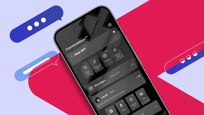
It’s a minimal launcher aimed at keeping things distraction-free and reducing screen time, but more than the clean look, it features a centralized hub for chats.
After testing it, I quickly loved the idea of having one place or screen for all my messages. However, there was a major constraint with how it functions.
Bubble apps are not enough
I wish for a useful way to manage sprawling chats without switching apps
Before switching to the Pixel, I used Xiaomi and Galaxy phones, both of which feature floating app bubbles for managing messages. For One UI, though, it takes it further by adding an Edge Panel for quick controls.
When I shifted to the Pixel Launcher, floating bubbles were one of the items I missed most. So, it was a relief when Google added native app bubbles with Android 17, giving me that same advantage.
Yet, with a growing number of messaging apps in my daily rotation, I found that bubbles aren’t enough to keep everything under control.
I wanted a dedicated, centralized hub to handle it all in one place, without the friction of constantly app-switching.
That’s where Ratio came in as one of the few Android launchers that supports this concept.
It features a clever implementation that converges multiple threads from all the different apps I use into a single feed.
What is Ratio Launcher?
Minimal and distraction-less design with a centralized inbox
Ratio is a minimal Android launcher, and it’s a top choice if you want a black-and-white Kindle-like UI and a distraction-free experience.
It offers a clean monotone UI with custom app icons that look like white glyphs. There are preloaded custom wallpapers, though you can only set a single background across the entire UI and its various screens.
Alternatively, you can opt for a blacked-out background when pulling up the menu, app list, and other sections rather than a blurred wallpaper.
The overall layout is straightforward. There’s a clean home screen, an app drawer, and two extra screens for widgets and conversations.
The initial setup places a few core apps on the home screen, which you can categorize. You can also expand this setup by creating your own custom categories.
I appreciate that I can tweak screen time limits or set usage goals from the home screen. It lets me customize limits in minutes or hours.
There’s also a handy app dashboard that displays insights like memory and time usage, along with options to customize individual app icons.
I love the concept of centralized messaging
But it’s wonky and not ready for prime time
As for the other screens, there’s a dedicated widget section that you can organize by app. Each widget container collapses or expands, making it easy to arrange a running list.
The other main section is the Conversations screen, which nests all your messages under one section. The feature is still in beta, and it lacks several basic functions I rely on daily.
While testing it, I realized the potential here goes beyond managing multiple chat apps.
I love the concept of having every chat appear in one location. It saves me a chunk of time by eliminating the need to hop between messaging apps.
It even lets me group or merge chats from multiple apps. I can combine conversations from WhatsApp, Instagram, and Messenger into a single unified thread.
This is remarkably handy if I’m talking to the same person across different platforms. For example, SMS messages and Messenger chats from my wife are consolidated into a single chat bubble.
Inside, conversations from each platform are separated into their own distinct threads. I can switch between the services through their icon.
Group creation is also supported across different users and apps, though you can’t combine conversations from the same app.
For merged conversations in Ratio launcher, you can select a main profile photo from the different apps. You can change this photo when accessing the merged conversations.
What I want from centralized conversations
Basic functions should work out of the gate
While I love the vision of centralizing chats in Ratio, the feature is largely unusable.
My grievances stem mainly from its beta state, with core features being broken and several basic elements missing entirely.
For starters, I ran into persistent reply issues. Most of the time, I could send one or two responses before the launcher completely stopped me from sending anything else.
This bug impacts multiple platforms, including Google Messages and Messenger, rendering the feature practically useless for me since I rely on those two apps.
Incoming messages still trickle in from contacts without issue, but I can’t reply to them.
I also wish there were a faster way to dismiss chats from this view. Right now, clearing a new message is a chore that requires long pressing the thread and tapping a separate button.
Perhaps this was designed to prevent accidental dismissals, but there needs to be an option for a quick swipe-to-dismiss gesture.
Another visual headache is that apps within grouped threads are only identified by tiny icons, making it surprisingly difficult to tell at a glance which platform I’m using.
Additionally, media previews like photos and videos aren’t supported, so I need to open the app to view them, which is actually counterproductive.
A strong launcher held back by its flaws
I appreciate the minimalist, distraction-free aesthetic and unified inbox that Ratio brings to the table. Keeping my home screen clean with fewer apps and widgets feels great and refreshing.
The digital wellbeing tools, like granular app limits, are equally fantastic at curbing my excessive screen time.
However, the half-baked, centralized messaging hub spoils the experience for me. I hope these bugs and missing basic controls will be addressed soon.
As for access, I feel like the premium subscription plan ($12 per week depending on your region and current promotions) that removes the ads has a steep asking price for a launcher that can’t get the bare essentials right.
It would be nice if the developers offered a reasonable yearly or one-time purchase option.
At the very least, there’s a free tier available in exchange for ad banners floating around, which is kinda annoying but should be tolerable.