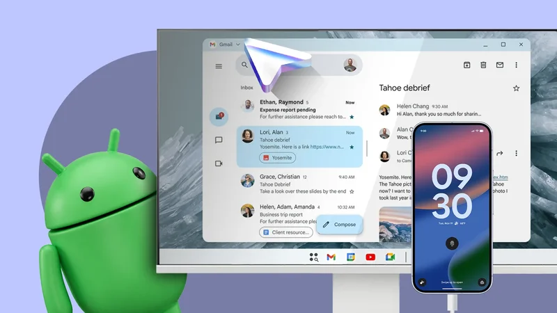
After years of development and teasing, Google rolled out an impressive new Desktop Mode with the March 2026 Feature Drop.
When connected to an external display, it turns your phone or tablet into something resembling a full-fledged desktop computer.
However, that's not the big screen problem plaguing Android. The apps are.
A polished desktop UI means little when the apps running inside its resizable windows still look and behave like phone apps.
A bigger window is not a better app
A larger screen means little when apps still behave like phone apps
Google has put a lot of work into improving the multitasking experience on Android on phones, tablets, and foldable devices.
App bubbles, a flexible taskbar, and Desktop mode are all part of that effort. Google even worked with Samsung on the windowing experience in Desktop mode to nail the basics.
While this shows Google's intent, it is not enough. None of these features solves Android's biggest large-screen problem: unoptimized apps.
This was one of the reasons Android tablets never took off and failed to compete with the iPad. Years later, there are still only a handful of Android apps optimized for tablets.
With foldables becoming more common and Desktop mode pushing Android onto monitors, this lack of optimization stings even more.
Ideally, an Android app should switch from a single-column layout to two or three columns on a larger screen to display more information.
Instead, many apps today stretch the same phone layout across more than 10 inches of display. This makes everything comically wide, introduces unwanted layout issues, and wastes valuable screen space.
Technically, the app works. But it behaves like one designed for phones, not one optimized for the big screen of a tablet or foldable.
That should not be the case. An optimized app should automatically adapt to the big screen and display more information.
Gmail is a great example of this. On a phone, it displays the inbox and opens emails on separate screens.On a tablet, it uses the additional space to show the inbox on the left and the selected email on the right.
This enables you to move between messages without repeatedly going back to the inbox.
An app optimized for the big screen reduces unnecessary navigation and displays more information at once.
That is the reason I want a larger screen. Not to see the same amount of information as on a phone, stretched across a bigger screen.
Google needs to stop asking developers nicely
Google can force apps to resize, but it cannot force good design
The blame for unoptimized tablet and foldable apps does not rest solely with Google.
It has spent years encouraging developers to build Android apps that adapt to different screen sizes. Plus, it provides the necessary design guidelines, responsive layout tools, and detailed documentation. Yet, the results remain disappointing.
Android 17 takes a more forceful approach. Apps targeting API level 37 will no longer be able to opt out of Android's large-screen orientation and resizability requirements. That means apps must handle portrait and landscape orientations and should be fully resizable.
This enforcement should help improve the experience for most apps on larger screens. However, this won't fully solve the problem.
Android can make an app fill the available screen space, but it cannot force it to switch to a two-pane layout or display more information.
Developers could comply with the API level 37 requirements while continuing to stretch the same phone layout across a tablet, foldable, or monitor.
If Google wants users to take large-screen Android devices seriously, it needs to give developers a stronger reason to optimize their apps properly.
The Play Store could identify apps optimized for tablets, foldables, and Desktop Mode, and give them greater visibility on those devices.
This would help users find apps that properly support their hardware while rewarding developers who took the time and effort for adaptive layouts. It would also put pressure on popular apps that continue to offer a poor tablet experience.
Google has spent years asking developers to improve their apps. With Android expanding to foldables, monitors, and other large-screen devices, it is time to make proper optimization difficult to ignore.
This is no longer just a tablet problem
Foldables and external monitors make Android's app gap impossible to ignore
Developers could previously treat Android tablets as a small, separate market that was not worth the additional effort. While valid at the time, this argument no longer holds up.
The same Android app must now run on a phone, an unfolded foldable, a tablet, and a desktop monitor.
So, an optimized layout will help the app function on all of these devices. It also allows developers to create an adaptive experience that scales across the Android ecosystem.
If anything, developers can capitalize on the lack of large-screen optimized apps for Android to stand out from the competition and gain greater visibility.
Google wants to bring Android to every screen possible. For that, it must ensure that the apps scale reliably beyond a phone's screen.
Time for Android apps to catch up
Desktop Mode is an important addition to Android. It may not seem that useful right now, but over time, it can become an indispensable feature.
However, the mode can only work if the apps running inside it are optimized for the big screen. If they only stretch out to fill the larger canvas, it will be a waste of space.
I do not need every Android app to become a desktop-class productivity tool. I only want apps to recognize the screen they are running on and use it intelligently.
A tablet should show more information than a phone. A foldable should make use of its inner display. An external monitor should not feel like a phone interface blown up.