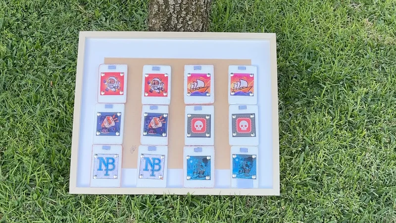
Adversary is a memory matching game with one change to the usual formula: hidden among the matching pairs is a Danger card that can mess up your round.
Since I started building it for Shipaton, I’ve been trying to share the decisions behind the game rather than only showing the finished product.
In my first article, the question was whether that single Danger card was enough to make a familiar memory game more interesting. Instead of assuming it worked, I built an early version around the mechanic and started testing the idea.
Then, in my second article, I moved from mechanics to visual identity. I explored more heavily themed directions, but ultimately decided that Adversary should still look and feel like a memory game. The Danger card should be the thing that disrupts something familiar.
For the next experiment, I took the core of Adversary out of the iPhone and onto a physical board.
Not because I’m turning it into a board game.
Mostly because Build in Public has pushed me to keep finding different ways to make the development process visible.
Building More Than the App
Most of what I’ve shared so far has been digital: gameplay experiments, UI decisions, icon ideas and the reasoning behind them.
A physical version gave me a completely different way to show the same concept.
Someone looking at the board doesn’t need to know anything about the code or how the game state works. They see a set of cards, understand that most of them have matches, and then discover that one of them doesn’t.
That is essentially the idea I’ve been trying to validate since the first article.
The physical board also fit nicely with the way I’ve been approaching Shipaton in general. Rather than disappear for weeks and come back with a finished app, I’ve been turning individual decisions and experiments into things I can share along the way.
This time, apparently, it meant foam, Velcro and arts and crafts.
The Prototype Had a Prototype
I still needed the board to actually work, so there was some experimentation involved.
The cards needed to stay attached while also being easy enough to remove and reveal. I started with one foam card rather than building the full set immediately.
That card became the test version. Glue didn’t hold the Velcro reliably enough, so I switched to strong double-sided tape. Then I discovered that my first piece of Velcro was so large that the card was difficult to remove.
So I made it smaller. Once that interaction worked, I repeated it across the rest of the cards, added the printed icons and reinforced the cards where needed.
There were other small problems along the way. The foam edges started breaking apart, some tape worked better than others, and I made a few spare cards in case something got damaged, but those details weren’t really the point of the project.
The useful part was the process itself: make one, test it, find the problem, adjust it, then move on.
Which is pretty much how I’ve been building the app too.
Making the Adversary Idea Visible
The most important part of the physical version wasn’t the material or how neatly I cut the foam.
It was preserving the structure of the game. Most cards have a matching partner. The Danger card doesn’t.
In the app, software handles everything surrounding that idea: the reveal animation, scoring, difficulty and what happens when the Danger card appears. On the board, most of that disappears.
What remains is the mechanic itself. That made the physical version an interesting continuation of the decision I wrote about in my second article. I had already chosen not to bury Adversary underneath a complicated visual theme. The physical board takes that simplicity even further.
There isn’t much there to distract from the premise.
Find the pairs. Try not to find the Danger card.
Build in Public doesn’t have to mean sharing screenshots. With Adversary, I’ve been trying to share more than finished features. The interesting parts are usually the questions behind them.
Looking back at the three experiments together, there is a clearer progression than I realized while I was doing them.
The first was about the mechanic: is the Danger card interesting enough to change the memory-game experience?
The second was about the identity: should Adversary become a heavily themed game, or should the familiar memory-game structure stay visible?
This one was about making that idea tangible.
The physical board isn’t replacing the app, and it isn’t a new product direction. It’s another Build in Public experiment around the same game.
And underneath the foam, tape and Velcro, the idea is still the same one I started with:
A familiar memory game, one card that doesn’t belong, and the uncertainty of what you’re about to reveal.
And underneath the foam, tape and Velcro, the idea is still the same one I started with:
A familiar memory game, one card that doesn’t belong, and the uncertainty of what you’re about to reveal.