Chrome and Android are different platforms, but that's never been a reason for them to feel disjointed. The desktop and web apps have themes and custom backgrounds I've wanted for years.
Now, Google's new homepage personalization update on closes the last gaps between the two platforms for me.
I feel like I have full control over my browsing setup. Here's how I'm making the most of my homepage.
The theme collections are personal
My new tabs feel and look alive
I got a happy surprise when I opened my Google Chrome Beta app and saw the notification for the new Appearance menu.
I normally use it over the regular browser because it's my best window into future features before their public release.
Rollouts are pretty siloed or staggered across users and regions, so I wouldn't have put it past Google to leave me out of the first wave.
It rolled out in Chrome for Android version 151.0.7922.71, while my standard browser was one full version behind. I've now received the update on the latter.
I tapped the three-dot button in the upper-right corner of the Beta browser and selected Customize new tab page to use it.
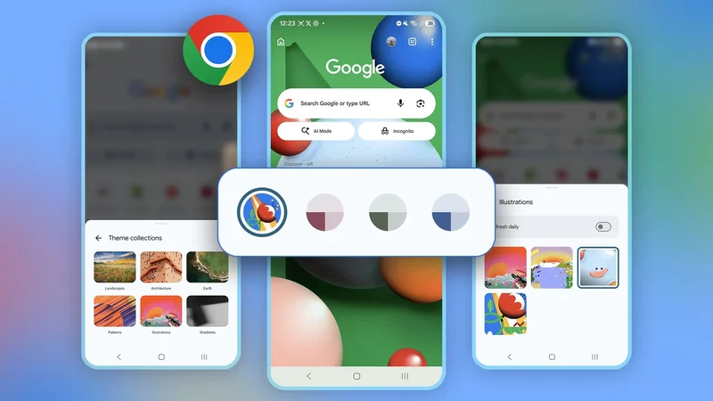
It opened a customization panel with My shortcuts, New tab page cards, Discover feed, and Appearance options.
Tapping the last one opened four more choices, each with its own preview thumbnail: Chrome Default, Upload an image, Chrome Colors, and Theme Collections.
I currently use the gradients under the last option because of their soft blend of colors bleeding into each other and the absence of distracting subjects.
I couldn't decide on a theme, so I turned on the Refresh Daily toggle to cycle through them automatically. I wish I could do the same for my phone's home screen without a third-party app.
That said, Chrome's default appearance has always looked static and flat.
The new backgrounds add a sense of depth. Interface elements look alive instead of just sitting there when I scroll through the Discover feed section.
If Chrome eventually lets users sync or assign different themes across profiles or groups, it would encourage faster context switching.
I benefit from visual cues across the multiple platforms I use for work every day, and I would appreciate a unique accent per project beyond the tab group colors.
Chrome is enough for me
I wish I had more needs to justify switching browsers
I can imagine Chrome's new theme collections being tied to routines. The browser already changes its appearance based on the system's default settings.
I scheduled my phone to switch between sunrise and sunset, so the app follows accordingly.
It would be nice to have a more dynamic system where themes match context, the way Android's Material You or Google Calendar already do.
There's a precedent where the former pulls colors from the wallpaper and applies them across icons, widgets, the notification shade, and system apps.
Also, I don't remember when I first noticed it. But when you create a new Google Calendar entry and type something like "birthday" or "flight," the banner image matches.
Google may auto-generate a cake with candles and balloons or display an airplane for that event.
I hate that it implies Chrome would have to infer context from browsing behavior, time of day, or which profile is active to do the same.
These are fuzzier signals that are harder to interpret, and there's the issue of how much the browser is allowed to infer about what I'm doing.
Google already has to walk the privacy line carefully. Meanwhile, Calendar's context-matching feature parses short, predictable pieces of text and maps them to a pre-built library of images.
Still, I appreciate Chrome as it is. It works well enough with other Google Workspace apps, and everywhere else without friction because it's built on Chromium.
It's also the foundation for other browsers, including Edge, Brave, and Opera. It's why I don't see myself switching anytime soon. Any parts I'd be chasing elsewhere aren't worth losing what I'm already getting.
A shiny coat of Chromium makes browsing polished
Chrome still won't be for everyone, and the new themes may not give you a reason to change anything. I care about the little things because I spend much of my working day inside the browser.
Beyond appearances, the Gemini Sidebar is another feature woven into my workflow.
It further customizes my search experience by letting me pull context from open tabs into a conversation. Research and comparisons are much easier because of it.